Content builder
The content builder can be used to create a page just for you that is customized to your preferences and set as your homepage. It can also be used to create a task or an entire course.
General settings
Justify content
Flex direction
Border style
Border editor
You can envision the structure and choose the information sequence of your course page or website and then implement it.
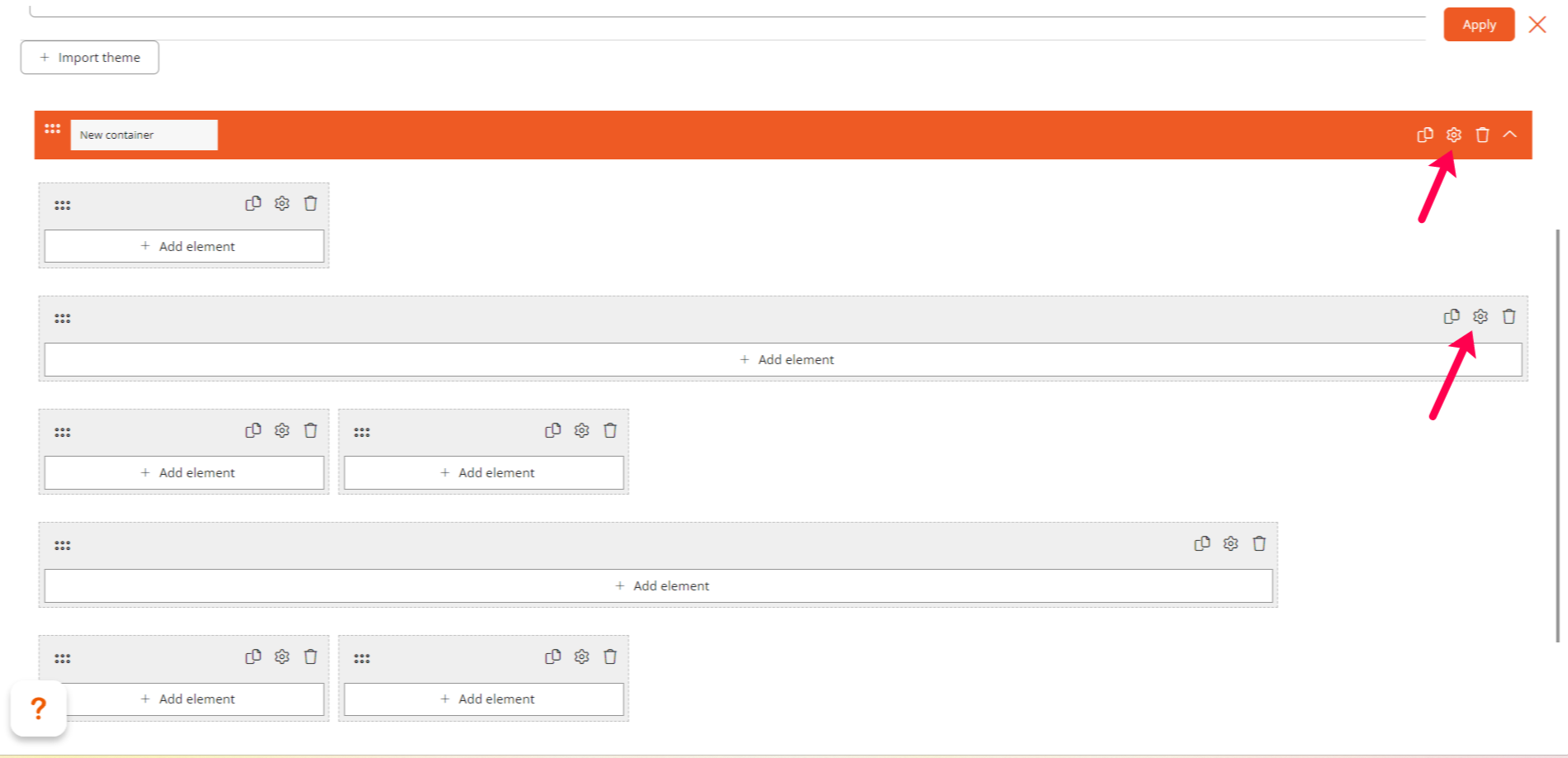
The first step in creating a new section is to add a container. The amount of containers you utilize depends on how you want to section the layout.
You can add any number of columns, in various styles, to each container. A preview will help you select the appropriate one. Simply drag and drop your columns and containers into the desired location if you want to change their order.
With the help of the container and column settings tab, you may modify the main components of your content builder.
General settings
Container width
- Having control over the container's width allows you to customize how wide items like text and images will be displayed.
Site width: content will be adjusted to the width of the site.
Full width: content will be adjusted to the width of the entire page. For best results, select a transparent header and hide breadcrumbs from the page settings.
Flex: all the elements will be automatically placed side by side without changing their display behavior.
Display
- You can place, show, or hide elements in your layout using the display section.
Flex: all the elements will be automatically placed side by side without changing their display behavior.
Block: each element will take the full width of a complete row.
None: the container can be concealed with this option.
Align Items
- The alignment of each item on the horizontal axis is controlled by this parameter.
Center: the items are aligned to the center of the horizontal axis.
Flex start: the items are all aligned to the start of the horizontal axis.
Flex end: the items are aligned to the end of the horizontal axis.
Stretch: all the items become the same height.
Justify content
- Justify content, affects how everything is aligned on the vertical axis.
Center: along the vertical axis, the items are arranged flush against one another toward the center of the container.
Flex start: depending on the flex container's vertical start side, the items are packed flush with one another toward the container's edge.
Flex end: relying on the vertical end side of the flex container, the items are packed flush with each other near the container's edge.
Normal: the items are arranged in their default order as though no value for justifying content had been specified.
Space between: within the container, the objects are arranged along the principal axis. Each consecutive pair of elements is separated by the same amount of space.
Space around: along the vertical axis, the items are spread throughout the container. Every pair of neighboring items is separated by the same amount of space. Half of the distance between each pair of adjacent items is made up of the vacant space between the first and last items.
Space evenly: along the container's vertical axis, the items are dispersed equally. Both the start edge and the first item's spacing as well as the end edge's separation from the last item are identical for each pair of adjacent items.
Flex direction
- This parameter specifies the container-level ordering of flex components.
Row: along the primary axis, the items are arranged in the same manner as the text direction.
Column: the items are arranged from top to bottom in the same manner as the text.
Margin & Padding
- These effective spacing tools, margin, and padding, are used between your elements.
Margin: by adjusting the top, bottom, left, and right values, you can regulate the area around an element's border.
Padding: this is a setting that lets you adjust an element's top, bottom, left, and right values to regulate the distance between its content and boundaries.
Border style
- The Border style attribute determines the line style for each of an element's four border sides.
None: this design does not have a border.
Solid: this design features a solitary, solid, straight line.
Dotted: with this design, numerous rounded dots are displayed.
Double: in this design, there are two straight lines.
Dashed: in this design, a series of dashes or line segments are displayed.
Border editor
-The outer border edge of an element has its corners rounded by the border-radius attribute. You can provide the border-radius as a percentage or a precise pixel size.
Border radius top left and right: the top left and right corners of an element's border can have their radius adjusted with this parameter.
Border radius bottom left and right: in the bottom left and right corners of an element, you can adjust the border-radius with this parameter.
Border width: this property allows you to set the width of an element's border in pixels.
Border color: this property allows you to set the color of an element's border and create the look you want.
Theme Settings
Background color: there you can edit the background color and the transparency of it
You can use an image from the files section or upload one to use as a background.
Related Articles
How to create a Blog Post Category
Available for: Business & Enterprise To create a blog post category navigate to the Post Categories section from the sidebar menu of your admin panel under Website and click on the + Create a button that appears on the top of your screen. From the ...How to connect my domain to Mindseed
Find it Quickly: Settings> Domain Find the video tutorial here. This article will guide you on how to connect your domain name with your Mindseed website. The process is straightforward and only requires a few steps, if your domain is being managed ...Zoom Integration
Find it Quickly: Settings > Authentications If you want to add Zoom meetings to your courses on Mindseed, please read this documentation. It explains how you can add, manage or remove the Zoom app from your mindseed admin interface. Prerequisites you ...Publication Settings
Find the video tutorial here. General Here you will be able to set the audience where your course will be visible. Publish your course and make it visible to your customers. There is a toggle switch to activate or deactivate. By publishing your ...Bundles
Available for: Business & Enterprise Plan A bundle is a combination of multiple courses of your choice, offered as a package. It can be used for two purposes: Bundling Products customers can buy as a "Single Package" Breaking Down long/content-heavy ...